BRANDING
The Tea Pracitioner
Client: The Tea Practitioner
Designer: Quan Tran
Copywriter: Kaylyn Jung
The Tea Practitioner is dedicated to integrating single origin loose-leaf tea into the Canadian culinary landscape. The company’s selections are mindfully sourced from small tea farms, run by tea producers who are dedicated to their craft. The Tea Practitioner aims to respect and promote ancient tea traditions while pushing the boundaries utilizing tea as an ingredient.
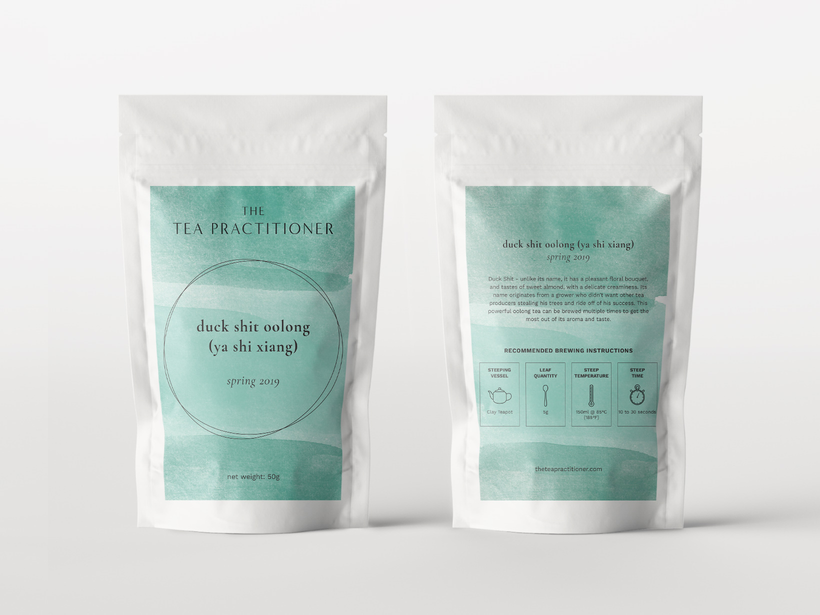
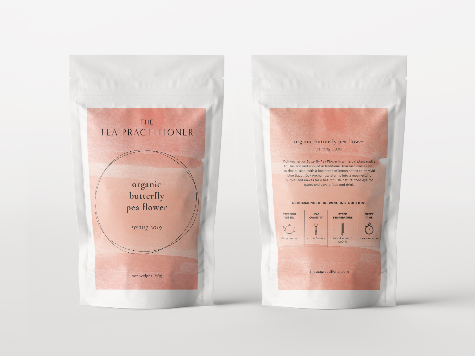
The Tea Practitioner wanted a brand identity that was simple, clean and elegant. The company aims to educate a younger audience on the world of tea, therefore it was really important to have an aesthetically-pleasing design (to appeal to us millennials).

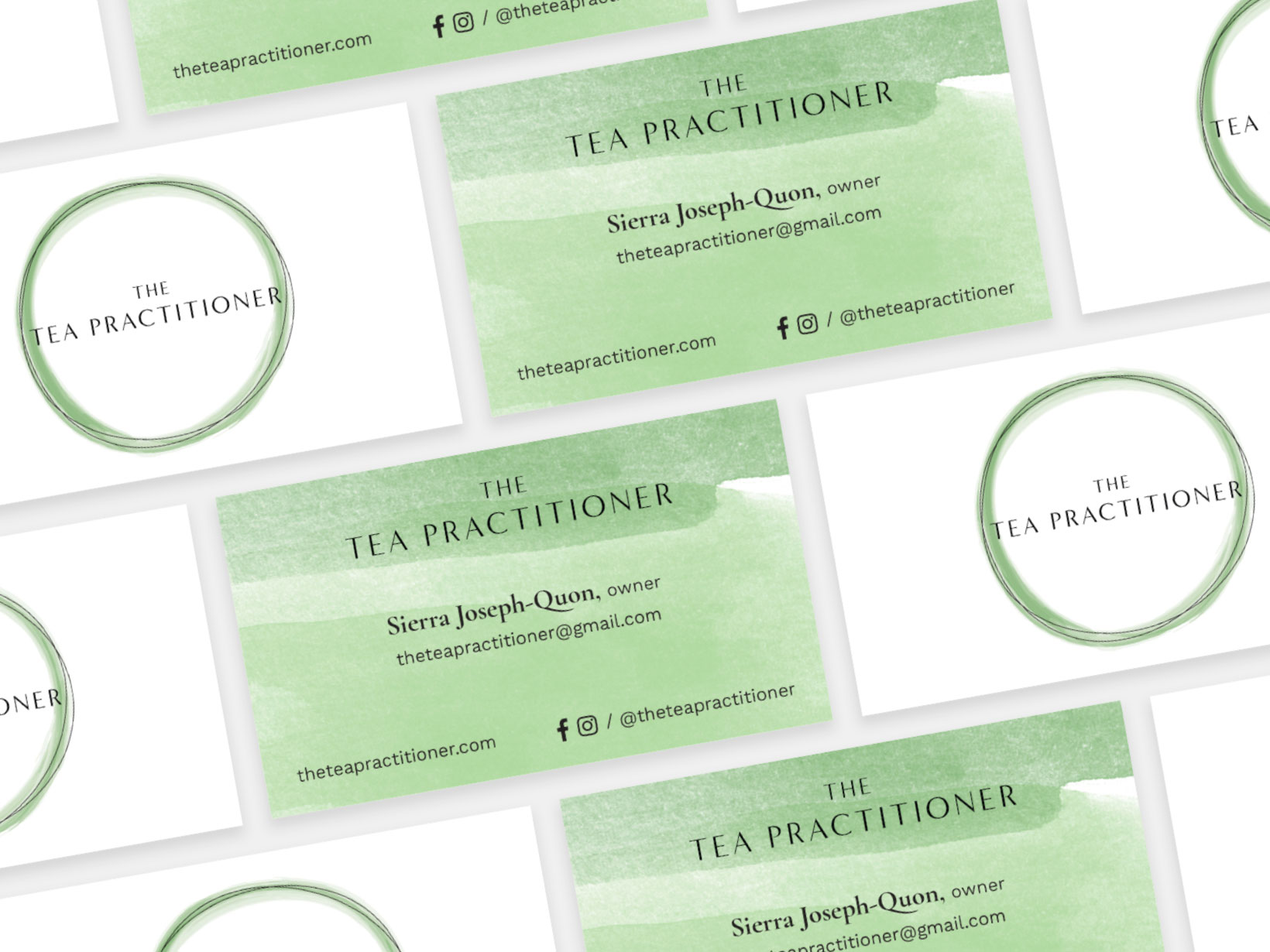
The logo is versatile and is made up of three components: the wordmark, a watercolour element and the overlapping lines that create a circle. Each of these components can exist on their own or be used individually across different touch-points of the brand.


Tea is believed to help induce calmness and a sense of relaxation, both states often visually represented with watercolour. In using a watercolour element, we were able to incorporate different colours into the visual identity. The colours were inspired by the liquor of the tea when they are brewed.
One of The Tea Practitioner’s core values is to educate their audience on the ancient traditions of teas, including how to properly brew them. In addition to the brewing instructions, it was important to The Tea Practitioner to include a description educating the tea drinker on the blend, ranging from its health benefits, to how to incorporate them into recipes, to the farm where the teas came from.
